Silverlight 內建 TabControl 樣式需複雜 XAML 重寫,改用 UserControl 組合實現高自由度分頁。
<UserControl x:Class="QXGameEngine.Control.QXTabControl" ...>
    <Canvas>
        <StackPanel x:Name="Head" />           <!-- 分頁標籤容器,支援橫向/縱向 -->
        <ContentPresenter x:Name="Body" />      <!-- 分頁內容,萬用變身控件 -->
    </Canvas>
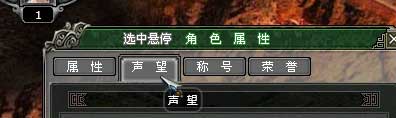
</UserControl>擴充 QXIcon 新增 IconTypes.HitModes,四張圖片對應:預設、滑鼠進入、選中、選中+滑鼠進入。
case IconTypes.HitModes:
    this.MouseEnter += (s, e) => { Container.Background = Hit ? HitNewBodySource : NewSource; };
    this.MouseLeave += (s, e) => { Container.Background = Hit ? HitBodySource : _BodySource; };
    this.MouseLeftButtonDown += (s, e) => { Hit = !Hit; };
    break;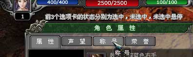
List<QXIcon> tabItemList = new List<QXIcon>();

public delegate void SelectionChangedEventHandler(object sender, QXIcon tabItem);
public event SelectionChangedEventHandler SelectionChanged;

// 點擊處理
tabItem.MouseLeftButtonDown += (sender, e) => {
    foreach (var icon in tabItemList) {
        if (icon == sender) { icon.Hit = true; icon.Container.Background = icon.HitNewBodySource; }
        else { icon.Hit = false; icon.Container.Background = icon.BodySource; }
    }
    SelectionChanged(this, sender as QXIcon);
    e.Handled = true;
};QXTabControl tc = new QXTabControl() {
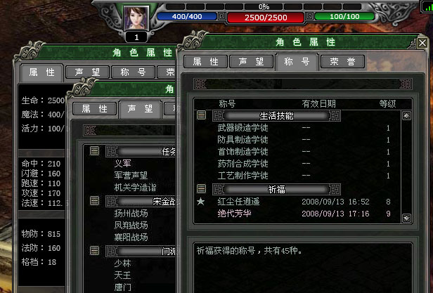
TabItemOrientation = Orientation.Horizontal, TabItemHeight = 28, BodyLeft = -4, BodyTop = 27 };
tc.AddItem(63, 28, 1, "/Image/Icon/39.png", "/Image/Icon/40.png", "/Image/Icon/41.png", "/Image/Icon/42.png", "屬 性");
tc.AddItem(63, 28, 1, "/Image/Icon/39.png", "/Image/Icon/40.png", "/Image/Icon/41.png", "/Image/Icon/42.png", "聲 望");
tc.AddItem(63, 28, 1, "/Image/Icon/39.png", "/Image/Icon/40.png", "/Image/Icon/41.png", "/Image/Icon/42.png", "稱 號");
tc.AddItem(63, 28, 1, "/Image/Icon/39.png", "/Image/Icon/40.png", "/Image/Icon/41.png", "/Image/Icon/42.png", "榮 譽");
tc.SelectionChanged += (sender, item) => {
var tabControl = sender as QXTabControl;
switch (item.Text) {
case "屬 性": tabControl.SetBody(leaderAttributePart); break;
case "聲 望": tabControl.SetBody(new Canvas() { Background = new ImageBrush(...), Width=350, Height=389 }); break;
case "稱 號": tabControl.SetBody(new Canvas() { Background = new ImageBrush(...), Width=350, Height=389 }); break;
default: tabControl.SetBody(null); break;
}
};
官方 NumericUpDown 樣式難改,核心在 RepeatButton。原理:按下→延遲→週期性觸發。擴充 QXIcon 新增 IconTypes.RepeatButton:
case IconTypes.RepeatButton:
    DispatcherTimer timer = new DispatcherTimer();
    timer.Tick += (s, e) => { timer.Interval = TimeSpan.FromMilliseconds(Interval); RepeatClick(this, e); };
    this.MouseEnter += (s, e) => { Container.Background = NewSource; };
    this.MouseLeave += (s, e) => { Container.Background = _BodySource; timer.Stop(); };
    this.MouseLeftButtonDown += (s, e) => { timer.Interval = TimeSpan.FromMilliseconds(Delay); timer.Start(); };
    this.MouseLeftButtonUp += (s, e) => { timer.Stop(); e.Handled = true; };
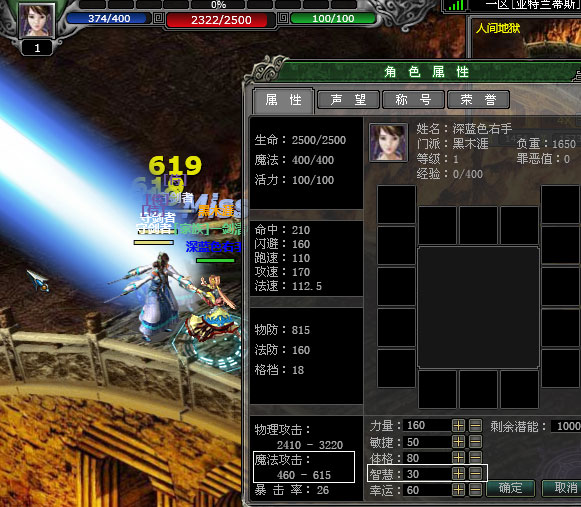
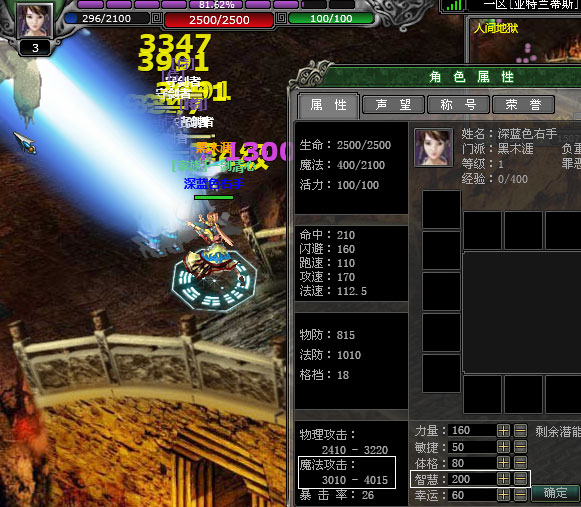
break;主角 5 大基礎屬性(力量、體格、敏捷、智慧、幸運),潛能點 1000 分配。智慧 30→200,魔法攻擊 460-615→3010-4015,雷射魔法傷害 600→3500。
面板類主題告一段落,後續重心轉向裝備、物品、技能的存放與拖動實作。
原始碼:目錄下載 / 線上演示:https://silverfuture.cn
出處:https://alamiye010.cnblogs.com/