WPF Diagram Designer 是一個開源的圖形設計器參考實現,展示了 WPF 控件模板、視覺樹、Thumb 操作、Adorner 裝飾等核心技術。本系列四篇筆記系統拆解其精髓。Part 1 聚焦最基礎的三大操作:移動、縮放、旋轉。
WPF 控件無預設外觀,完全由 `ControlTemplate` 定義。關鍵概念:
<Canvas>
    <Canvas.Resources>
        <ControlTemplate x:Key="DesignerItemTemplate" TargetType="ContentControl">
            <ContentPresenter Content="{TemplateBinding Content}"/>
        </ControlTemplate>
    </Canvas.Resources>
    <ContentControl Name="DesignerItem" Width="100" Height="100" Canvas.Top="100" Canvas.Left="100"
                      Template="{StaticResource DesignerItemTemplate}">
        <Ellipse Fill="Blue"/>
    </ContentControl>
</Canvas>`Thumb` 專為拖曳設計,提供 `DragStarted`、`DragDelta`、`DragCompleted` 三大事件。設計器三大操作均繼承 `Thumb` 並處理 `DragDelta`。
public class MoveThumb : Thumb {
    public MoveThumb() { DragDelta += MoveThumb_DragDelta; }
    void MoveThumb_DragDelta(object sender, DragDeltaEventArgs e) {
        var item = DataContext as ContentControl;
        if (item == null) return;

        Point delta = new Point(e.HorizontalChange, e.VerticalChange);
        // 若有旋轉變換,需將位移向量反向旋轉
        if (item.RenderTransform is RotateTransform rt)
            delta = rt.Transform(delta);

        Canvas.SetLeft(item, Canvas.GetLeft(item) + delta.X);
        Canvas.SetTop(item, Canvas.GetTop(item) + delta.Y);
    }
}<ControlTemplate x:Key="DesignerItemControlTemplate" TargetType="ContentControl">
<Grid>
<s:MoveThumb DataContext="{Binding RelativeSource={RelativeSource TemplatedParent}}" Cursor="SizeAll"/>
<ContentPresenter Content="{TemplateBinding Content}"/>
</Grid>
</ControlTemplate>內容視覺(如 Ellipse)預設會攔截滑鼠事件,導致 MoveThumb 無法接收拖曳。解決:
<Ellipse Fill="Blue" IsHitTestVisible="False"/>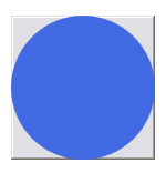
public class ResizeThumb : Thumb {
    public ResizeThumb() { DragDelta += ResizeThumb_DragDelta; }
    void ResizeThumb_DragDelta(object sender, DragDeltaEventArgs e) {
        var item = DataContext as Control; if (item == null) return;
        double dV, dH;
        switch (VerticalAlignment) {
            case VerticalAlignment.Bottom: dV = Math.Min(-e.VerticalChange, item.ActualHeight - item.MinHeight); item.Height -= dV; break;
            case VerticalAlignment.Top: dV = Math.Min(e.VerticalChange, item.ActualHeight - item.MinHeight); Canvas.SetTop(item, Canvas.GetTop(item) + dV); item.Height -= dV; break;
        }
        switch (HorizontalAlignment) {
            case HorizontalAlignment.Left: dH = Math.Min(e.HorizontalChange, item.ActualWidth - item.MinWidth); Canvas.SetLeft(item, Canvas.GetLeft(item) + dH); item.Width -= dH; break;
            case HorizontalAlignment.Right: dH = Math.Min(-e.HorizontalChange, item.ActualWidth - item.MinWidth); item.Width -= dH; break;
        }
        e.Handled = true;
    }
}<ControlTemplate x:Key="ResizeDecoratorTemplate" TargetType="Control">
<Grid>
<s:ResizeThumb Height="3" Cursor="SizeNS" Margin="0 -4 0 0" VerticalAlignment="Top" HorizontalAlignment="Stretch"/>
<s:ResizeThumb Width="3" Cursor="SizeWE" Margin="-4 0 0 0" VerticalAlignment="Stretch" HorizontalAlignment="Left"/>
<s:ResizeThumb Width="3" Cursor="SizeWE" Margin="0 0 -4 0" VerticalAlignment="Stretch" HorizontalAlignment="Right"/>
<s:ResizeThumb Height="3" Cursor="SizeNS" Margin="0 0 0 -4" VerticalAlignment="Bottom" HorizontalAlignment="Stretch"/>
<s:ResizeThumb Width="7" Height="7" Cursor="SizeNWSE" Margin="-6 -6 0 0" VerticalAlignment="Top" HorizontalAlignment="Left"/>
<s:ResizeThumb Width="7" Height="7" Cursor="SizeNESW" Margin="0 -6 -6 0" VerticalAlignment="Top" HorizontalAlignment="Right"/>
<s:ResizeThumb Width="7" Height="7" Cursor="SizeNESW" Margin="-6 0 0 -6" VerticalAlignment="Bottom" HorizontalAlignment="Left"/>
<s:ResizeThumb Width="7" Height="7" Cursor="SizeNWSE" Margin="0 0 -6 -6" VerticalAlignment="Bottom" HorizontalAlignment="Right"/>
</Grid>
</ControlTemplate>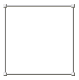
public class RotateThumb : Thumb {
    private double _initialAngle; private RotateTransform _rotateTransform;
    private Vector _startVector; private Point _centerPoint;
    private ContentControl _item; private Canvas _canvas;

    public RotateThumb() { DragDelta += RotateThumb_DragDelta; DragStarted += RotateThumb_DragStarted; }

    void RotateThumb_DragStarted(object sender, DragStartedEventArgs e) {
        _item = DataContext as ContentControl; if (_item == null) return;
        _canvas = VisualTreeHelper.GetParent(_item) as Canvas; if (_canvas == null) return;

        // 旋轉中心點(相對 Canvas)
        _centerPoint = _item.TranslatePoint(
            new Point(_item.Width * _item.RenderTransformOrigin.X, _item.Height * _item.RenderTransformOrigin.Y), _canvas);

        Point startPt = Mouse.GetPosition(_canvas);
        _startVector = Point.Subtract(startPt, _centerPoint);

        _rotateTransform = _item.RenderTransform as RotateTransform;
        if (_rotateTransform == null) { _item.RenderTransform = new RotateTransform(0); _initialAngle = 0; }
        else _initialAngle = _rotateTransform.Angle;
    }

    void RotateThumb_DragDelta(object sender, DragDeltaEventArgs e) {
        if (_item == null || _canvas == null) return;
        Point currentPt = Mouse.GetPosition(_canvas);
        Vector deltaVector = Point.Subtract(currentPt, _centerPoint);
        double angle = Vector.AngleBetween(_startVector, deltaVector);
        if (_item.RenderTransform is RotateTransform rt) rt.Angle = _initialAngle + Math.Round(angle, 0);
        _item.InvalidateMeasure();
    }
}<Style TargetType="{x:Type s:RotateThumb}">
<Setter Property="RenderTransformOrigin" Value="0.5,0.5"/>
<Setter Property="Cursor" Value="Hand"/>
<Setter Property="Template"><Setter.Value><ControlTemplate TargetType="{x:Type s:RotateThumb}">
<Grid Width="30" Height="30">
<Path Fill="#AAD0D0DD" Stretch="Fill" Data="M 50,100 A 50,50 0 1 1 100,50 H 50 V 100"/>
</Grid></ControlTemplate></Setter.Value></Setter>
</Style>
<ControlTemplate x:Key="RotateDecoratorTemplate" TargetType="Control">
<Grid>
<s:RotateThumb Margin="-18,-18,0,0" VerticalAlignment="Top" HorizontalAlignment="Left"/>
<s:RotateThumb Margin="0,-18,-18,0" VerticalAlignment="Top" HorizontalAlignment="Right">
<s:RotateThumb.RenderTransform><RotateTransform Angle="90"/></s:RotateThumb.RenderTransform>
</s:RotateThumb>
<s:RotateThumb Margin="0,0,-18,-18" VerticalAlignment="Bottom" HorizontalAlignment="Right">
<s:RotateThumb.RenderTransform><RotateTransform Angle="180"/></s:RotateThumb.RenderTransform>
</s:RotateThumb>
<s:RotateThumb Margin="-18,0,0,-18" VerticalAlignment="Bottom" HorizontalAlignment="Left">
<s:RotateThumb.RenderTransform><RotateTransform Angle="270"/></s:RotateThumb.RenderTransform>
</s:RotateThumb>
</Grid>
</ControlTemplate>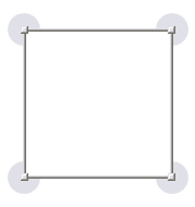
<Style x:Key="DesignerItemStyle" TargetType="ContentControl">
    <Setter Property="MinHeight" Value="50"/> <Setter Property="MinWidth" Value="50"/>
    <Setter Property="RenderTransformOrigin" Value="0.5,0.5"/>
    <Setter Property="Template"><Setter.Value><ControlTemplate TargetType="ContentControl">
        <Grid DataContext="{Binding RelativeSource={RelativeSource TemplatedParent}}">
            <Control x:Name="RotateDecorator" Template="{StaticResource RotateDecoratorTemplate}" Visibility="Collapsed"/>
            <s:MoveThumb Template="{StaticResource MoveThumbTemplate}" Cursor="SizeAll"/>
            <Control x:Name="ResizeDecorator" Template="{StaticResource ResizeDecoratorTemplate}" Visibility="Collapsed"/>
            <ContentPresenter Content="{TemplateBinding Content}"/>
        </Grid>
        <ControlTemplate.Triggers>
            <Trigger Property="Selector.IsSelected" Value="True">
                <Setter TargetName="ResizeDecorator" Property="Visibility" Value="Visible"/>
                <Setter TargetName="RotateDecorator" Property="Visibility" Value="Visible"/>
            </Trigger>
        </ControlTemplate.Triggers>
    </ControlTemplate></Setter.Value></Setter>
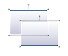
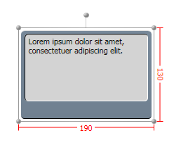
</Style>替代方案:不在 Template 內直接放裝飾器,而是透過 `Adorner` 動態添加,支援更豐富的裝飾(如快捷工具列)。
public class DesignerItemDecorator : Control {
    private Adorner _adorner;
    public static readonly DependencyProperty ShowDecoratorProperty = DependencyProperty.Register(
        "ShowDecorator", typeof(bool), typeof(DesignerItemDecorator),
        new FrameworkPropertyMetadata(false, ShowDecoratorProperty_Changed));
    public bool ShowDecorator { get => (bool)GetValue(ShowDecoratorProperty); set => SetValue(ShowDecoratorProperty, value); }

    static void ShowDecoratorProperty_Changed(DependencyObject d, DependencyPropertyChangedEventArgs e) {
        var decorator = (DesignerItemDecorator)d;
        if ((bool)e.NewValue) decorator.ShowAdorner(); else decorator.HideAdorner();
    }
    void ShowAdorner() { /* 建立 DesignerItemAdorner 加入 AdornerLayer */ }
    void HideAdorner() { /* 從 AdornerLayer 移除 */ }
}public class DesignerItemAdorner : Adorner {
private readonly VisualCollection _visuals;
private readonly DesignerItemAdornerChrome _chrome; // 自定義裝飾內容控件
public DesignerItemAdorner(ContentControl designerItem) : base(designerItem) {
_chrome = new DesignerItemAdornerChrome { DataContext = designerItem };
_visuals = new VisualCollection(this) { _chrome };
}
protected override int VisualChildrenCount => _visuals.Count;
protected override Size ArrangeOverride(Size finalSize) { _chrome.Arrange(new Rect(finalSize)); return finalSize; }
protected override Visual GetVisualChild(int index) => _visuals[index];
}
| 技術點 | 關鍵類別/機制 | 核心邏輯 |
|---|---|---|
| 移動 | MoveThumb + DragDelta | Canvas.SetLeft/Top 更新位置,考慮旋轉變換向量修正 |
| 縮放 | ResizeThumb (8個) + VerticalAlignment/HorizontalAlignment | 根據對齊方向調整 Width/Height 與 Canvas.Top/Left |
| 旋轉 | RotateThumb + Vector.AngleBetween | 計算滑鼠向量與中心點向量夾角,更新 RotateTransform.Angle |
| 模板化 | ControlTemplate + TemplateBinding + ContentPresenter | 外觀與邏輯分離,DataContext 綁定 TemplatedParent 傳遞操作對象 |
| 命中測試 | IsHitTestVisible="False" | 讓內容視覺透傳滑鼠事件給底層 MoveThumb |
| 裝飾層 | Adorner + AdornerLayer | 選中時動態添加裝飾視覺,不影響主視覺樹佈局 |
掌握這套「模板定義外觀、Thumb 處理交互、Adorner 承載裝飾」的 WPF 設計器核心模式,即可構建任意複雜度的視覺化編輯器。