本文介紹五個常用基礎控件的屬性、事件與 XAML/C# 宣告方式,涵蓋進度指示、開關切換、超連結、下拉選單等互動元素。
表示不確定等待狀態,IsActive 控制動畫播放。
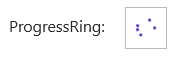
<ProgressRing x:Name="progressRing" IsActive="True" Width="40" Height="40"/>
var ring = new ProgressRing { IsActive = true, Width = 40, Height = 40 };
layoutRoot.Children.Add(ring);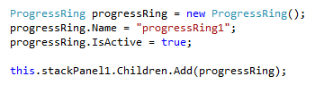
支援確定進度與不確定模式。


<ProgressBar x:Name="progressBar" Value="50" Maximum="100"
             IsIndeterminate="False" Height="10"/>

var bar = new ProgressBar { Value = 50, Maximum = 100, IsIndeterminate = false };
layoutRoot.Children.Add(bar);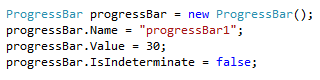
觸控友善的開關控件,支援自訂開/關文字。
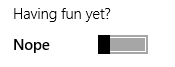
<ToggleSwitch x:Name="toggleSwitch"
              Header="通知設定"
              OnContent="開啟" OffContent="關閉"
              IsOn="True" />
var toggle = new ToggleSwitch {
    Header = "通知設定",
    OnContent = "開啟",
    OffContent = "關閉",
    IsOn = true
};
layoutRoot.Children.Add(toggle);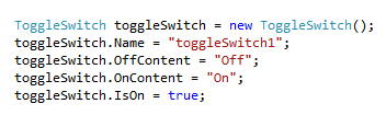
按鈕外觀的超連結,點擊導航至 URI。

<HyperlinkButton x:Name="linkButton"
                 Content="造訪官網"
                 NavigateUri="https://example.com" />
var link = new HyperlinkButton {
    Content = "造訪官網",
    NavigateUri = new Uri("https://example.com")
};
layoutRoot.Children.Add(link);

單選下拉清單,支援資料繫結與 SelectionChanged 事件。
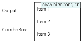
<ComboBox x:Name="comboBox" SelectionChanged="ComboBox_SelectionChanged">
    <ComboBoxItem Content="選項 1"/>
    <ComboBoxItem Content="選項 2"/>
    <ComboBoxItem Content="選項 3"/>
</ComboBox>

var combo = new ComboBox();
combo.Items.Add("選項 1");
combo.Items.Add("選項 2");
combo.SelectionChanged += Combo_SelectionChanged;
layoutRoot.Children.Add(combo);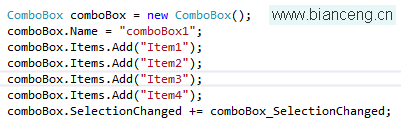
基礎控件掌握後,下一章將介紹 Slider、Image、Tooltip、Popup、PasswordBox 等進階控件。