頁面頂部固定導航列(position: fixed; top: 0)導致表格固定表頭(position: sticky; top: 0 或 fixed)被遮擋,設定 top: 50px 無效。

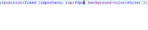
position: fixed 元素脫離文件流,不佔據空間。表格表頭的 top: 0 是相對視口定位,而非相對導航列底部。
<nav class="navbar-fixed-top">...</nav>
<div class="navbar-placeholder"></div> <!-- 新增佔位 -->
<table class="data-table">...</table>

.navbar-fixed-top { height: 50px; }
.navbar-placeholder { height: 50px; } /* 與導航列等高 */
.data-table thead th { position: sticky; top: 50px; }:root { --nav-height: 50px; }
.navbar-fixed-top { height: var(--nav-height); }
.data-table thead th {
position: sticky;
top: var(--nav-height);
}function updateTableHeaderOffset() {
const nav = document.querySelector('.navbar-fixed-top');
const headers = document.querySelectorAll('.data-table thead th');
const height = nav.offsetHeight;
headers.forEach(th => th.style.top = height + 'px');
}
window.addEventListener('resize', updateTableHeaderOffset);
window.addEventListener('load', updateTableHeaderOffset);
// 若導航列高度會變(如摺疊),需在變更時呼叫 updateTableHeaderOffset().page-container {
height: calc(100vh - 50px);
overflow-y: auto;
padding-top: 50px;
}
.data-table thead th { position: sticky; top: 0; }| 場景 | 推薦方案 | 優點 | 缺點 |
|---|---|---|---|
| 固定高度導航列 | 方案一、二 | 純 CSS、效能最好 | 高度變更需改 CSS |
| 動態高度導航列 | 方案三 | 即時響應 | 需 JS、有重排開銷 |
| 複雜佈局、多固定元素 | 方案四 | 架構清晰、避免層疊上下文衝突 | 需調整整體佈局 |
z-index:確保表頭 z-index > 表格內容,但 background-color:固定表頭必須設定背景色,否則滾動時會透出底下內容border-collapse:使用 separate 而非 collapse,否則 sticky 可能失效