TCategoryPanelGroup 是 Delphi 2009 強化的可摺疊面板容器,其 HeaderStyle 屬性決定標題列渲染方式,提供三種內建樣式:
hsGradient:漸層填充 (預設)hsImage:自訂圖片背景hsThemed:跟隨系統主題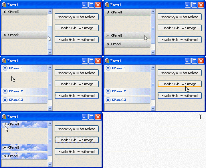
uses ExtCtrls;

procedure TForm1.FormCreate(Sender: TObject);
begin
  // 初始化三個面板高度與標題
  CategoryPanel1.Height := ClientHeight div 2;
  CategoryPanel2.Height := CategoryPanel1.Height;
  CategoryPanel3.Height := CategoryPanel1.Height;
  CategoryPanel1.Caption := 'CPanel1';
  CategoryPanel2.Caption := 'CPanel2';
  CategoryPanel3.Caption := 'CPanel3';

  Button1.Caption := 'HeaderStyle := hsGradient';
  Button2.Caption := 'HeaderStyle := hsImage';
  Button3.Caption := 'HeaderStyle := hsThemed';
end;

procedure TForm1.Button1Click(Sender: TObject);
begin
  CategoryPanelGroup1.HeaderStyle := hsGradient;
end;

procedure TForm1.Button2Click(Sender: TObject);
begin
  // hsImage 需先載入圖片至 HeaderImage
  CategoryPanelGroup1.HeaderImage.LoadFromFile('c:\temp\hbg.bmp');
  CategoryPanelGroup1.HeaderStyle := hsImage;
end;

procedure TForm1.Button3Click(Sender: TObject);
begin
  CategoryPanelGroup1.HeaderStyle := hsThemed;
end;
GradientBaseColor (起始色) 到 GradientColor (結束色) 線性漸層GradientDirection (gdHorizontal/gdVertical) 控制方向HeaderImage (TImageList) 中的圖片作為標題背景HeaderImage.LoadFromFile(...) 或設計期指定HeaderFont 控制
procedure TForm1.ApplyCustomGradient(BaseColor, EndColor: TColor; Direction: TGradientDirection);
begin
  CategoryPanelGroup1.HeaderStyle := hsGradient;
  CategoryPanelGroup1.GradientBaseColor := BaseColor;
  CategoryPanelGroup1.GradientColor := EndColor;
  CategoryPanelGroup1.GradientDirection := Direction;
end;

// 呼叫範例
ApplyCustomGradient(clNavy, clBlue, gdVertical);
// 需自行繪製 OnPaint 事件或使用 TImageList 九宮格支援
// Delphi 內建不直接支援九宮格,建議 hsGradient + 自繪 或 第三方控件
procedure TForm1.SetHeaderFont(const FontName: string; Size: Integer; Color: TColor; Style: TFontStyles);
begin
  CategoryPanelGroup1.HeaderStyle := hsThemed;
  with CategoryPanelGroup1.HeaderFont do
  begin
    Name := FontName;
    Size := Size;
    Color := Color;
    Style := Style;
  end;
  // 強制重繪
  CategoryPanelGroup1.HeaderFont := CategoryPanelGroup1.HeaderFont;
end;
| 方式 | 程式碼 | 優缺點 |
|---|---|---|
| 設計期指定 | 物件檢視器設定 HeaderImage | ✅ 部署簡單,❌ 執行期難動態更換 |
| 執行期 LoadFromFile | HeaderImage.LoadFromFile('path') | ✅ 靈活,❌ 需部署圖片檔,路徑易出錯 |
| 資源檔載入 | HeaderImage.LoadFromResourceName(HInstance, 'RES_NAME') | ✅ 內嵌執行檔,✅ 部署無憂,推薦 |
| Base64 解碼 | 程式碼內嵌 Base64 字串解碼載入 | ✅ 無外部依賴,❌ 程式碼膨脹 |
HeaderImage 已載入有效圖片,且圖片尺寸適合標題高度HeaderFont.Color 是否與背景衝突,hsGradient 時建議設定對比色BeginUpdate/EndUpdate 或鎖定視窗更新間切換HeaderStyle 讓 TCategoryPanelGroup 具備從簡潔漸層、品牌圖片到原生主題的完整視覺適應力。掌握三種模式特性與切換技巧,配合 GradientBaseColor/Color、HeaderImage、HeaderFont 微調,即能打造符合產品定位的專業摺疊面板介面。