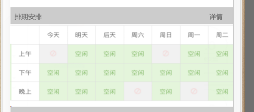
在 LinearLayout 中放置兩個 CheckBox,期望它們水平均分寬度、文字完整顯示,但實際運行時文字被截斷或佈局不均勻。
layout_weight<LinearLayout
android:layout_width="match_parent"
android:layout_height="wrap_content"
android:orientation="horizontal">
<CheckBox
android:layout_width="0dp"
android:layout_height="wrap_content"
android:layout_weight="1"
android:text="選項一"
android:gravity="center"
android:buttonTint="@color/colorPrimary" />
<CheckBox
android:layout_width="0dp"
android:layout_height="wrap_content"
android:layout_weight="1"
android:text="選項二"
android:gravity="center"
android:buttonTint="@color/colorPrimary" />
</LinearLayout>
| 屬性 | 值 | 作用 |
|---|---|---|
layout_width | 0dp | 配合 weight 時必須設為 0,避免自身寬度干擾分配 |
layout_weight | 1 | 兩個均為 1,表示 1:1 平分父容器剩餘寬度 |
gravity | center | 文字在 CheckBox 內水平居中,防止偏左/偏右 |
layout_width="0dp",導致 weight 不生效或文字擠壓。orientation 未設為 horizontal。ellipsize="end" 或 singleLine="true",導致換行破壞佈局。若需圖標與文字垂直排列,可將 CheckBox 替換為 RadioButton 並設置 android:button="@null" + android:drawableTop="@drawable/selector",同樣配合 weight 實現均分。
掌握 weight=1 + width=0dp 黃金組合,輕鬆搞定各類均分佈局需求。