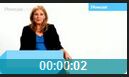
圖片底層 → 半透明色塊 (如黑色 40% 透明度) → 文字內容 (如時間標籤) 置於色塊上方。常見於影片列表、相簿封面、商品卡片。
-
 00:00:02
.media-item {
  float: left;           /* 或 display: inline-block / flex item */
  position: relative;    /* 關鍵:建立定位基準 */
  /* width/height 由圖片撐開或固定 */
}

.img-wrapper {
  display: block;        /* 消除圖片底部間隙 */
  position: relative;    /* 也可直接在 .media-item 上定位 */
}

.time-label {
  position: absolute;    /* 關鍵:脫離文檔流,相對最近定位祖先定位 */
  left: 0;
  bottom: 0;             /* 貼底對齊 */
  width: 100%;           /* 橫向鋪滿 */
  height: 30px;          /* 固定高度 */
  line-height: 30px;     /* 文字垂直置中 */
  color: #fff;           /* 文字白色 */
  font-size: 12px;
  text-align: center;

  /* 半透明黑色背景 */
  background: #000;
  opacity: 0.4;          /* 現代瀏覽器 */
  filter: alpha(opacity=40); /* IE8- 相容 */
  zoom: 1;               /* IE hasLayout 觸發 */
}
.time-label {
  position: absolute;
  left: 0; bottom: 0; width: 100%;
  padding: 5px 10px;
  color: #fff;
  background: rgba(0, 0, 0, 0.5); /* 僅背景半透明,文字不受影響 */
  box-sizing: border-box;
}
<style>
.media-list { list-style: none; padding: 0; margin: 0; }
.media-item { float: left; margin-right: 10px; position: relative; }
.media-item img { display: block; width: 110px; height: 110px; }
.time-label {
  position: absolute; left: 0; bottom: 0; width: 100%; height: 30px; line-height: 30px;
  color: #fff; text-align: center; background: rgba(0,0,0,0.5); font-size: 12px;
}
</style>
<ul class="media-list">
  <li class="media-item">
    <img src="0.jpg" alt="縮圖">
    <span class="time-label">00:00:02</span>
  </li>
</ul>
圖片疊加半透明層與文字的標準做法:**父容器相對定位 + 覆蓋層絕對定位貼底/鋪滿 + `rgba()` 或 `opacity` 控制透明度**。結構清晰、相容性好、易維護。避免使用負 margin 或複雜 float 組合。